
Flora: Designing for Florist Efficiency
Case Study
Petals & Photos by Fatima • May 2022 - Present • UX researcher & designer • Case study PDF
Project Overview

The product
Flora is an order management app that is being developed to aid in florists’ daily tasks. It allows florists to keep track of every aspect involved with fulfilling requests for floral arrangements. It sorts and stores all orders, keeps track of stock and inventory, as well as organizes the florist’s calendar to reflect each client received.
Context
Flora is a project app that is being developed for my client, Petals and Photos by Fatima. It is intended to be a solution that evolved from my client’s original request: Build a floral arrangement preview app to help the business
Discovery
I began my process wanting to answer two simple questions, “Why do we need a floral arrangement preview app?” and “Would a floral arrangement preview app be helpful to florists?”
To get my answers, I decided to conduct field studies and user interviews. I interviewed my mother, her florist, and her florist competitors in her city. I was even fortunate enough to find a flower shop next to my dry cleaners one day, so I walked in and asked if I could interview them too.
Hypothesis
I found my field studies to be very successful as it yielded two major breakthroughs. First, I discovered that my original product concept would not help my target user. Second, and more importantly, I discovered a problem that every target user seemed to share.
“Florists report that they receive significantly more customer complaints from online orders when compared to those made in-person.”
Using the data I gathered from my observations and interviews, I hypothesized a solution.
Florists need to improve their system of organization and communication when processing online orders.
After following up with the original interviewees and receiving positive feedback on my proposed solution, I decided to pitch it to Petals & Photos by Fatima. Upon getting the enthusiastic approval, I began designing the order management app for florists, Flora.
Challenges
So far, I have been working on this project as a team of one, fulfilling both roles of UX researcher and designer. I have also been operating with little to no budget on this project as I cannot, in good conscience, charge my mother money for any work that I do.
The problem:
Florists report that they receive significantly more customer complaints from online orders when compared to those made in-person.
The goal:
To research and identify possible causes of the problem, and create a product aimed at resolving it.
The user:
Florists, and small-business owners of flower shops
Research Overview
Methods
Discovery
Field studies
User interviews
Exploration
Competitive analysis
Persona building
Journey mapping
User stories
Testing
Moderated usability studies
Background and Goals
Generative Research Goals
Discover common pain points within our target users’ workflow in regards to completing customer orders
Understand our target personas’ workflow when receiving and processing customer orders
Identify and highlight areas of improvement
Design Research Goals
Evaluate the effectiveness of the order inbox design for the purposes of our target users’ needs
Assess if the product’s core functions have provided the users a more effective alternative when compared to their traditional methodologies
Understanding the user
Exploratory research
I created user personas and user stories to give my project this starting point, a figurative compass to help guide my direction. This provides me a point of reference to ensure I’m constantly making decisions to benefit my target user. I also conducted a competitive analysis of both direct and indirect competitors to my small-business flower shop. This, paired with a user’s journey map that I created, provided me with insight for opportunities of improvement for my target users’ processes.
Starting the design
One of Flora’s most valuable use flows is having the target user receive, review, and then accept (or reject) a customer’s order received online. Knowing this, I created multiple iterations of paper wireframes detailing the app screens involved with solutions to address the shortcomings of the old system. I then refined those paper wireframes, and created digital wireframes as I zeroed in further on what I thought the user might need in the process.
After a few iterations of my digital wireframes, and finalizing all my necessary screens involved in my main use flow, I felt ready to convert them into a low-fidelity prototype, and I was ready for testing.
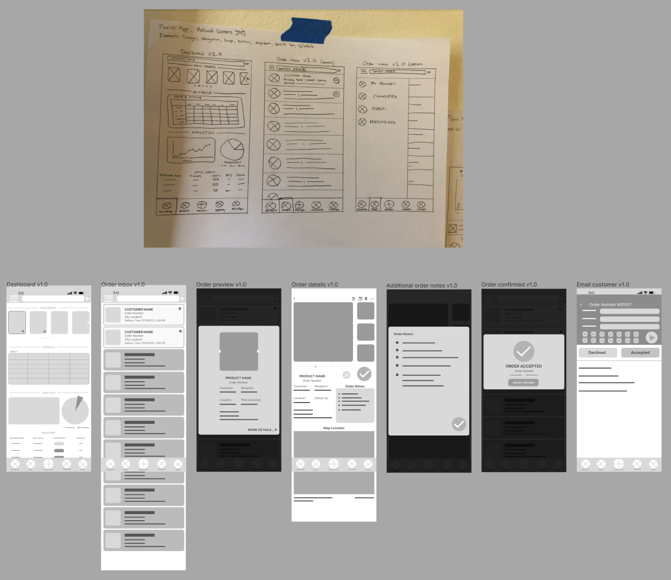
Above is a screenshot taken in Figma, showing some of the low-fidelity wireframes involved.
Testing the design
To learn if I had presented my target users with an improved alternative to their old process, I decided to conduct a moderated usability study.
The research goal for these studies was to find out if florists are able to process online orders quickly and more efficiently through the app. I created a research study plan using a list of research questions I needed answered, along with the key performance indicators (KPIs) I needed to measure the app’s effectiveness. I also included the script used for each participant in the study plan.
For additional details, see the study plan here.

Figure above is a slide taken from the usability study’s research report. It shows the screens involved in this round of user testing.
Findings / Results
A research presentation of this usability study can be found here.
After being content with the notes that I have gathered, I decided to organize my notes to create an affinity diagram. I wrote each note that I found to be valuable into stickies in Jamboard. After each note had been put into a sticky note, I arranged them within my Jamboard, and grouped any patterns I found.
When I have successfully grouped my notes into patterns, I began to establish them into themes. After synthesizing the themes I discovered, I was able to present the following:
Insights
Needs clear labels and buttons
Users need buttons to instinctively represent the function they perform
Notes feature is confusing
Without instruction, users are unable to see the potential value and use for the notes feature
Information should be available at a glance
In a fast-paced environment, users need to be able to easily find all information they might need on one screen
Actions are too final
Users need the ability to undo actions like accepting an order, in case an error was made

Figure above is a screenshot of the affinity diagram I made in Jamboard to organize my notes from the first usability study.
Takeaways
Impact
My research uncovered several areas for improvement within the process of receiving customer orders. Although these improvements in organization are going to be consolidated within the Flora app, the florists from Petals and Photos by Fatima were already able to utilize my data and recommendations to make manual adjustments to their process, thus improving process time and efficiency while reporting an increase in recent customer satisfaction. After a month since the implementation of changes, the business has not received a single customer complaint about their online order fulfillment.
What I learned
In my research, I learned that providing the clients the solution they think they want and actually solving their problems are not always synonymous. Utilizing data from field studies can be crucial in the discovery phase, as it can provide me with observations that users may not have even noticed.
To read the full case study, click here.
or