
MMiM: Remote UX & User-Centric Design
Case Study
Meet Me in the Middle startup • August 2022 - Present • UX researcher & designer • Case study PDF
Table of Contents
Or, view the case study presentation here.
Project Overview

Product:
Meet Me in the Middle (MMIM) provides a simple way to find an agreeable place to meet between two locations while considering distance, type of meeting place, and quality. Logged-in users can send a location proposal to other users without needing or seeing the physical address of the other party, allowing for privacy and simplicity.
Duration:
August 2022 to Present
The problem:
People who need to meet with others face the task of finding a location that would be a fair distance for both parties.
The goal:
Design a user-friendly web application that provides options for a meeting location that is both suitable and fair for both parties, and provide tools for the protection of their privacy.
The user:
Users that need to meet up with others, including online marketplace sellers/buyers, online dating app users, ages 18-70.
Context
When I joined the team, MMiM had already been realized as a fully-functioning web prototype and was already in the middle of their Phase 1 of development. I was fully aware that since I was joining the project while they were already in the middle of it, I basically had to “hit the ground running” and quickly adapt to the team’s Agile environment. Fortunately, our UX Writer had quickly brought me up to speed with some product use cases that they had previously identified, so I had a solid enough starting point to begin with.
Knowing this, I decided to plan my own personal road map in order to catch up quickly and provide the team with the research and design support that they needed. I needed to gather a lot more context and data for the project, and had a very small time-frame to work with — so I did what I can.
Things I did within the first two weeks since joining the team:
User interviews
Heuristic markup / evaluation
Moderated usability study
Interactive prototype
Product branding
Team
Meet Me in the Middle is a fully remote, cross-functional team collaboration effort comprised of:
3 back-end developers
3 front-end developers
1 UX Writer & Content Designer
1 UX Researcher & UX Designer (Myself)

Above is a screenshot of our team’s “Zoom Photo Day.” This was taken shortly after completing our Phase 1 development phase as we all definitely really wanted to commemorate such a momentous event. (1 FE member not pictured)
Research
Methods
Heuristic markup/evaluation
One of the first things I did upon joining the team was create a heuristic markup report. I wanted my first time interacting with the MMiM prototype to be as valuable as possible by highlighting possible user pain-points from the prototype’s features/design.
My heuristic markup can be found here.

A slide taken from my heuristic markup of MMiM’s first prototype, detailing possible source of user pain-point. (View the full report by clicking on the image or link above)
User interviews
Using the product use cases that the team had already identified prior to me joining, I conducted some casual user interviews with any participant I could manage to encounter that fit might fit the criteria. The main use cases identified were users of online marketplace apps, online dating apps, or individuals with faraway friends.
I interviewed friends, friends of friends, and individuals I met through social networking communities.
Competitive audit
For the team to get a better idea of what features users might prioritize when using app our app, and any other other pain-points they might need solved, I conducted a competitive audit using a list of both direct and indirect competitors. I created a Google spreadsheet detailing each competitor, and took note of each characteristic such as their size, unique value proposition, brand identity, user flow, and even brand identity and tone etc.
Users
Persona building
I created user personas for the MMiM web app using data I gathered from the initial user interviews. This involved listening to the users' needs and preferences to understand their behaviour, motivations and goals. I then used this information to create user profiles with detailed descriptions, goals, objectives and motivations that would serve as a foundation for the MMiM web app development process. This was an effective way to ensure that the app was designed to meet the needs and expectations of the users.

Jasmine is one of the fictional user personas I created by noting and combining similar traits and characteristics I gathered from real user interviews.
Creating user stories
Using the data gathered from user interviews and user personas, I was able to create user stories for the MMiM web app. Through the user interviews I was able to get an understanding of the user’s needs and expectations, while the user personas enabled me to clearly define each user’s individual goals for the web app.
“As a young college student that wants to make some extra money, I want to be able to safely meet customers I find in online platforms so that I can have an extra source of income without risking my safety or privacy.”
Journey mapping
I created journey maps for users trying to meet someone by first outlining their journey, which included the steps taken to meet someone, the user's expectations, and the emotional states experienced along the way. I then mapped out different scenarios and paths the user could take, such as how they might meet someone online or in person, and how they might manage potential obstacles or roadblocks. Finally, I visualized the journey map to provide a holistic overview that could be used to plan and strategize how to best meet someone.

Based on user interviews, user personas, and user stories, I created a journey map of the likely actions a user might take in order to meet people in-person prior to using MMiM.
Testing
Moderated usability studies
The first user test we performed with the MMiM’s original prototype was a moderated usability study, planned and conducted by me. Working with a budget of $0, I gathered volunteers that matched a certain criteria by utilizing any network available to me (LinkedIn networks, friends of friends, Discord and Slack communities, etc.).
As soon as I was able to determine their availability, I sent them Google Meet invites and recorded each session for further notetaking and data synthesis (with their expressed permission and consent, of course).
View the research study plan for more details here.

Above is a slide taken from the MMiM case study slide deck, showing screenshots of real test participants during the moderated usability study.
Unmoderated usability studies
After implementing some design changes based on insights gathered from the user tests, I decided that I should conduct an unmoderated usability study to provide us with a figurative “temperature check” before we entered Phase 2 of the MMiM web app development stage. I wanted to ensure that the design changes and features we’ve implemented so far were still leading us to the right direction. I specifically wanted these tests to be unmoderated in order to observe how users interacted with our product with as little interference or influence as possible, close to how they would in a real-world scenario.
Still operating with very little to no budget, I used userbrain.com to recruit participants that would go through the test prompts I’ve created.

Above is an example of one of the prompts to gather data from users during the unmoderated user testing.
Insights
My process with synthesizing user data is pretty straightforward, and it is how I was trained in the Google UX Design Specialization program. First, I rewatched all the recordings multiple times and took note of any of my observations of the user in a spreadsheet. I noted their click path, facial expression, tone of voice, perceived mood etc. I also noted any important quotes they might have provided. I took this data and transferred important ones to sticky notes within Jamboard.
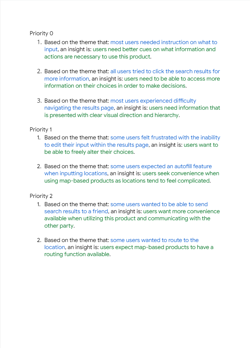
I then assessed if there were any common themes, and grouped the insights accordingly to create an affinity map. I prioritized these insights based on how common they were among all participants, and their importance to the functionality of the product.
Priority 0
Based on the theme that: most users needed instruction on what to input, an insight is: users need better cues on what information and actions are necessary to use this product.
Based on the theme that: all users tried to click the search results for more information, an insight is: users need to be able to access more information on their choices in order to make decisions.
Based on the theme that: most users experienced difficulty navigating the results page, an insight is: users need information that is presented with clear visual direction and hierarchy.
Priority 1
Based on the theme that: some users felt frustrated with the inability to edit their input within the results page, an insight is: users want to be able to freely alter their choices.
Based on the theme that: some users expected an autofill feature when inputting locations, an insight is: users seek convenience when using map-based products as locations tend to feel complicated.
Priority 2
Based on the theme that: some users wanted to be able to send search results to a friend, an insight is: users want more convenience available when utilizing this product and communicating with the other party.
Based on the theme that: some users wanted to route to the location, an insight is: users expect map-based products to have a routing function available.


Design
Wireframes

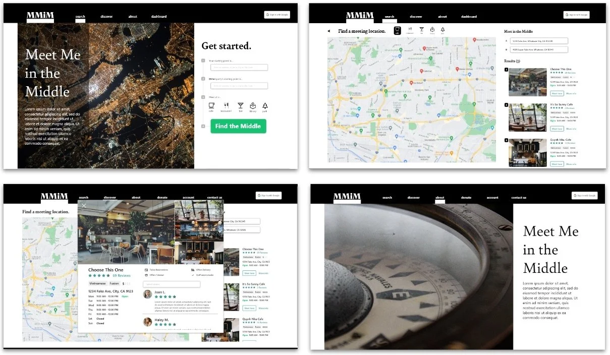
The front-end development team had already built out digital wireframes for the main screens of the first MMiM prototype prior to me joining them. I was tasked with building on this groundwork and refining with further iterations going forward.

The original prototype presented the user with input fields for two addresses, offering no additional instruction. With my first wireframes, I aimed to utilize some space in order to provide some context and instruction to users.
Low-fidelity prototype
The first prototype I built out was focused on the product’s main use flow of non-logged in users searching for meeting locations. We added additional screens to provide an option for users to submit error tickets for gathering additional data on the launched prototype.

This low-fidelity prototype (built in Adobe XD) can be found here.
Mockups
Based on the insights from the usability study, I made changes to improve user experience on the site’s starting point. Users needed more context and instruction to know how to utilize the web app, so the design decisions I made were centered around providing this solution.

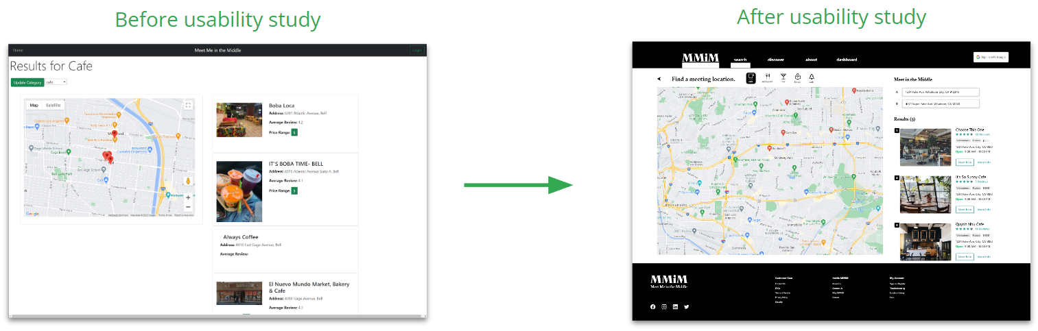

As we work in an Agile environment, minor tweaks and changes to the design are made to accommodate for any changes. Above is the updated version as of 11/25/2022.
Challenges
Some of the challenges I’ve faced in developing this web app are:
Being a solo UX Researcher and UX Designer operating in an Agile environment, there isn’t always an opportunity to do research.
Being a solo UX Researcher and UX Designer, having to explain to developers what UX is can be a bit overwhelming. It can be difficult to constantly explain what I do, why I do it, and how it can benefit them.
Having no funding for any research endeavor, I’m forced to seek out volunteers myself and utilize free tools.
Having no dedicated Product Manager means I often have to really try and sway the group to incorporate user-centric decisions in the road map.
With all that said, despite being aware of these challenges prior to my recruitment, I found myself indescribably excited to take them on. I could not think of a better environment to learn and grow as a UX Researcher and Designer, in fact I still retain every bit of that enthusiasm to this day.
Takeaways
Impact
Our user research data strongly shows that the design is intuitive and easy to navigate through. The web app was found to be more engaging, and demonstrated a clear visual hierarchy. Furthermore, directly due me and my UX colleague’s contributions to the project and the effectiveness of the user research, I have recently been appointed to act as one of three acting Product Managers for the MMiM team.
These achievements excite me most as it signifies that my UX colleague and I have been successfully demonstrating the importance of UX principles to team members that had little to no knowledge of it beforehand.
What I learned
My experience with Meet Me in the Middle (MMiM) and my team members have been so incredibly valuable. I truly felt like I have learned so much in the short time I’ve been with them, it’s difficult to express them all.
Some of the most notable things I’ve learned are:
The value of always advocating for the user. Convincing an entire team that making changes for the benefit of the user can be difficult, but often worth it once the improvement is apparent with user interaction.
The value of staying organized with asynchronous communication. Working in and Agile environment can be difficult, with many things constantly changing. Keeping good communication with team members is a great way to stay on top of things.
The value of keeping my insights and recommendations concise. I have always struggled with expressing my thoughts in a concise manner. I always feel like there’s so much more context I can provide to my team members behind my decisions, but I’ve learned that this often has the opposite desired effect as a lot of people simply stop paying attention the more information you give them.
Yes, the irony is not lost on me as my case studies also tend to go on the longer side. I promise, I am constantly going through an iterative process and I have learned how to condense information when applicable. This particular case study has just been difficult as it is still an ongoing project, thus constantly changing.
Summary
This project is an example of a user-friendly web application that provides options for a meeting location that is suitable and fair for both parties, and provides tools for the protection of their privacy. It was developed by a remote, cross-functional team with 3 back-end developers, 3 front-end developers, 1 UX Writer & Content Designer, and 1 UX Researcher & UX Designer (myself).
To help create the web app, I used a combination of:
heuristic markup
user interviews
competitive audit
persona building
user stories
journey mapping
moderated and unmoderated usability studies
wireframes
mockups
Challenges included working with no budget, explaining UX to developers, and advocating for the user. The application has been successful so far, with user research data demonstrating that it was intuitive and easy to navigate through.